98% of websites fail basic accessibility standards. This one couldn’t.
The starting point wasn’t a brief — it was a statistic. According to WebAIM, 98% of websites contain measurable WCAG errors. At the same time, roughly two thirds of the population experience some form of barrier when using digital products.
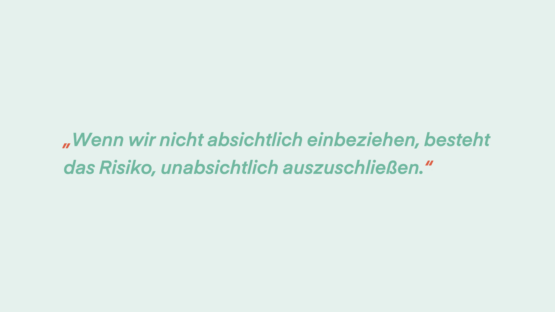
98% of websites contain WCAG accessibility errors — and the most common ones are entirely preventable
This matters most for the people who have no alternative. In the food and agriculture sector, employees are legally required to complete hygiene and workplace safety training before they can start work. Many of these employees come from Romania, Bulgaria, and Poland, recruited through staffing agencies. Some speak little German. Some have limited literacy. Some share a phone with a family member.
The goal of this thesis: design a web app for employee onboarding and training that genuinely works for all of them — without compromise. Built in collaboration with doinstruct, a software startup focused on workplace knowledge transfer.
You can’t design for people you don’t understand
Before any wireframe, I spent weeks understanding the target group — not as a category, but as individuals with specific lives, constraints, and expectations.
The primary users were production workers, harvest helpers, and food processing employees — typically from Eastern Europe, aged 18–65, recruited for seasonal or agency work. I conducted contextual interviews with an integration officer at a food company, researched Eastern European cultural context and its implications for interface design, and mapped the full stakeholder landscape.
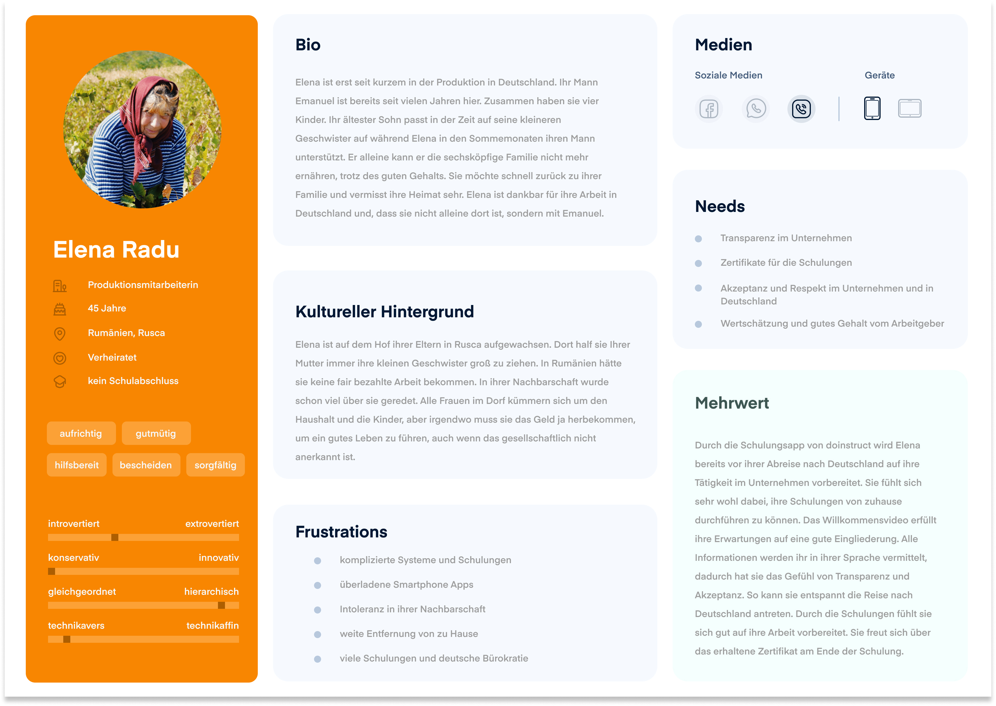
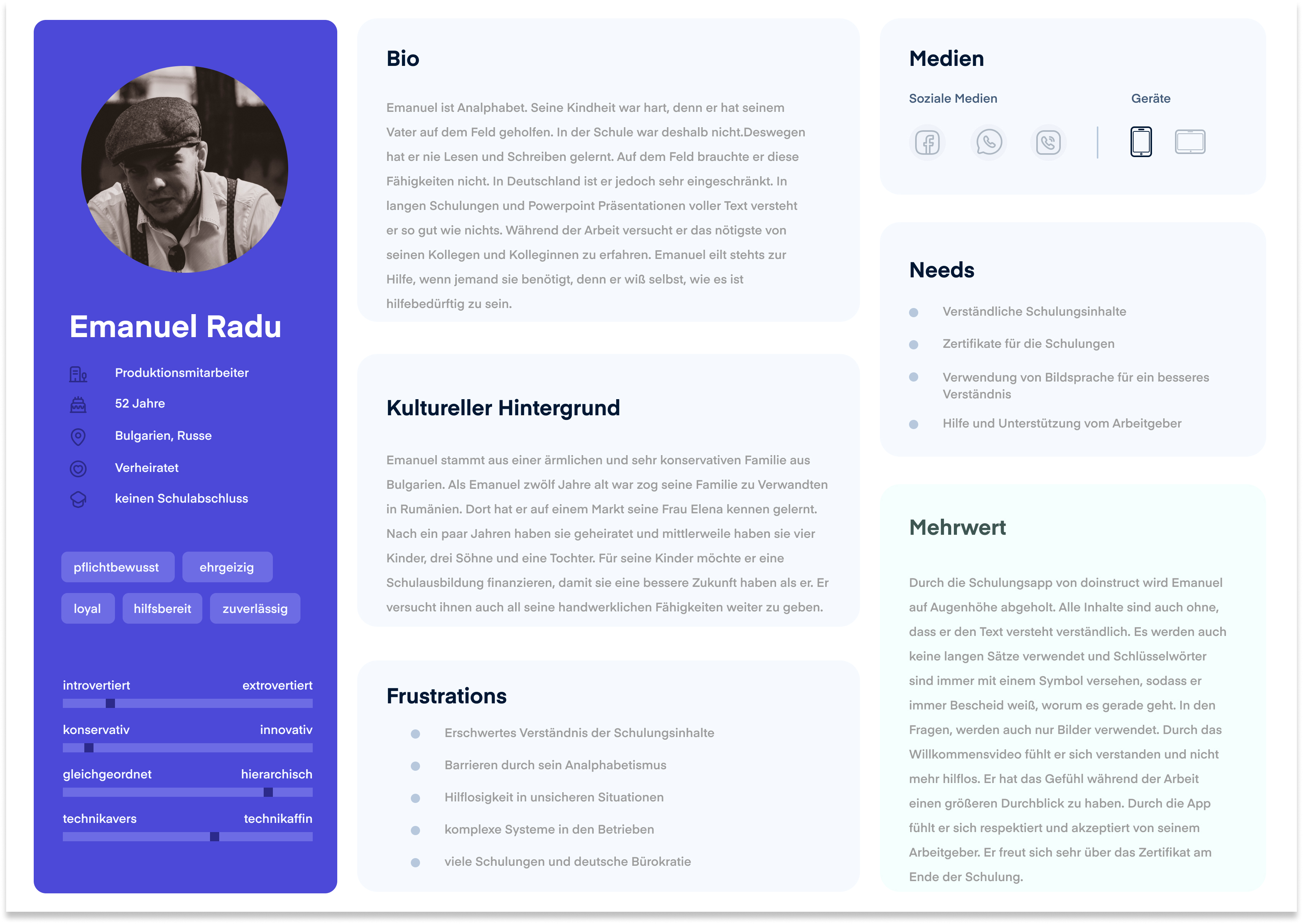
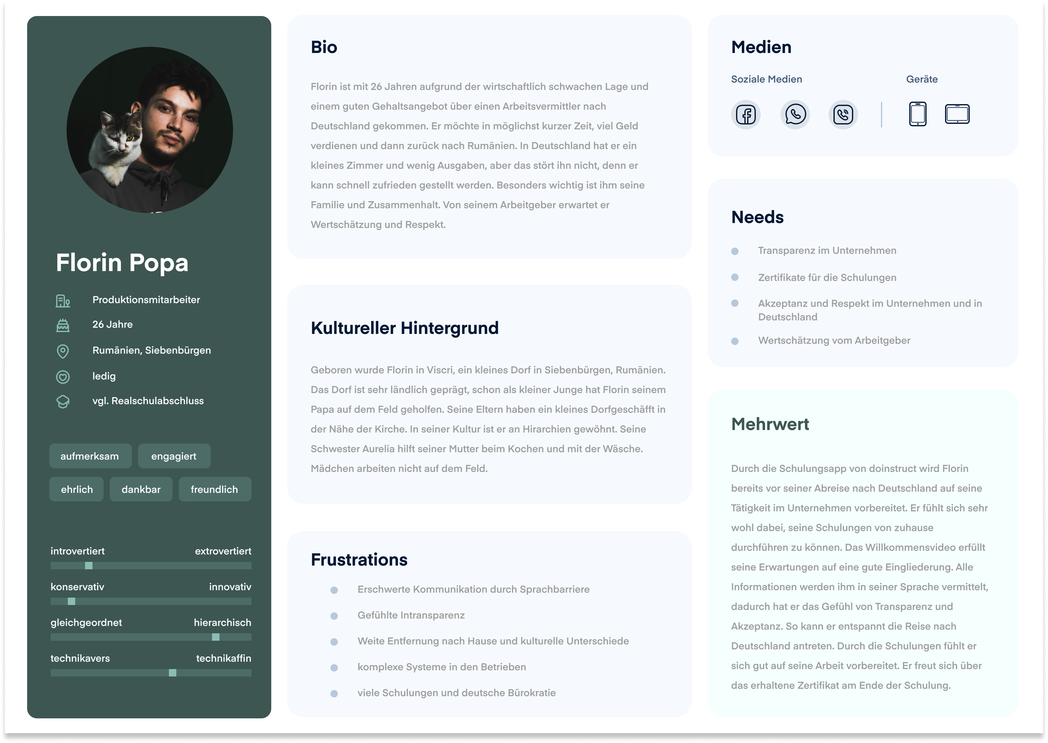
Three primary personas developed from field research — Elena, Emanuel, and Florin. Production workers from Romania and Bulgaria, aged 18–65, recruited for seasonal or agency work.
Key research findings shaped every subsequent decision:
No email, no app store. Many users in Romania and Bulgaria don’t have email addresses and download apps exclusively via mobile data. A web app accessible via SMS link was the only viable delivery mechanism.
Phones are shared. Family members often share a single device, making personal login credentials impractical. Authentication had to identify individuals without relying on account history.
Conservative, hierarchical culture. Eastern European cultural context — particularly Romanian and Bulgarian — values clarity, respect, and transparency. Users expect direct instructions, clear feedback, and to be treated with dignity. Ambiguity or perceived condescension creates distrust.
Language is not the only barrier. Beyond the five supported languages (German, English, Romanian, Bulgarian, Polish), a significant portion of users have low literacy or functional illiteracy. Any design relying on reading comprehension would systematically exclude them.
I defined three stakeholder levels: employees (primary users), HR and quality managers (secondary — they feed data in and receive results), and company leadership (tertiary — liable if employees aren’t certified).
A deliberately linear journey — with no dead ends
The app reaches users via a single SMS containing a personalised link. No login. No app store. No email. Opening the link in a mobile browser starts the training.
The flow was designed to be linear and unambiguous: one path forward, one path back. At no point should a user face a decision they aren’t equipped to make.
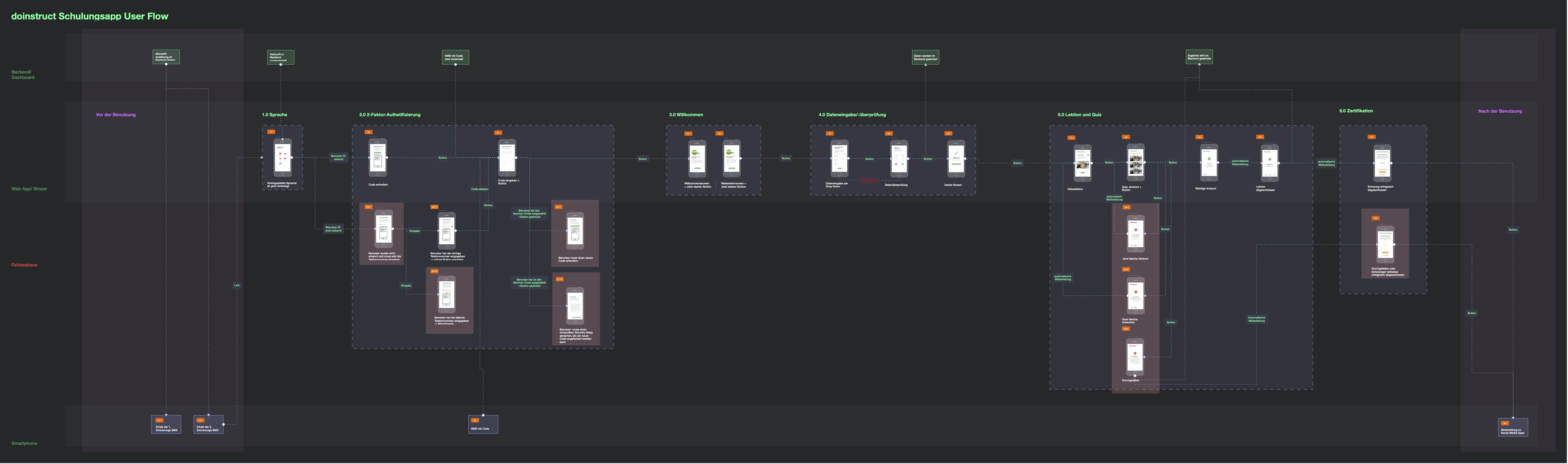
Full user flow — from SMS delivery through language selection, 2FA, data input, four training modules with quiz logic, to certificate. Error paths and retry loops are shown at every stage.
Language selection comes first — before anything else asks the user to read or interact. Five flags, one tap.
Two-factor authentication identifies the user by their personalised link, then asks them to select a 2-digit code sent via SMS. Early testing showed users couldn’t enter their own phone number reliably — many didn’t have it memorised. The solution: pre-identification via the link, with a multiple-choice code selection. In most cases, users see the code as an SMS banner notification without needing to switch apps.
Data input collects clothing sizes for workwear — distributed across separate screens (gender → top → trousers → shoes → confirmation), with a final review step before committing. One question per screen reduces cognitive load and eliminates the confusion of long forms.
Four training modules follow: Infection Protection Law, Workplace Safety, Food Hygiene, Corona Measures. Each is a 4–6 minute video (professionally produced, in all five languages) followed by a quiz. Users cannot skip forward in videos. The module structure mirrors legal training requirements.
Quiz logic is designed around learning, not just pass/fail. Each module has a pool of five questions. Users must answer three correctly. On a wrong answer, a different replacement question appears (not the same one again). After each answer — right or wrong — the app explains why, with an image. A user who guesses correctly still sees the reasoning. If a user fails a module entirely, their manager is notified to re-train them personally.
Every design decision was a hypothesis. Testing proved most of them wrong.
The project ran through nine design versions, each driven by findings from testing. The visual and structural changes from Version 1 to Version 9 reflect a fundamental shift: from an interface that seemed intuitive to one that actually was.
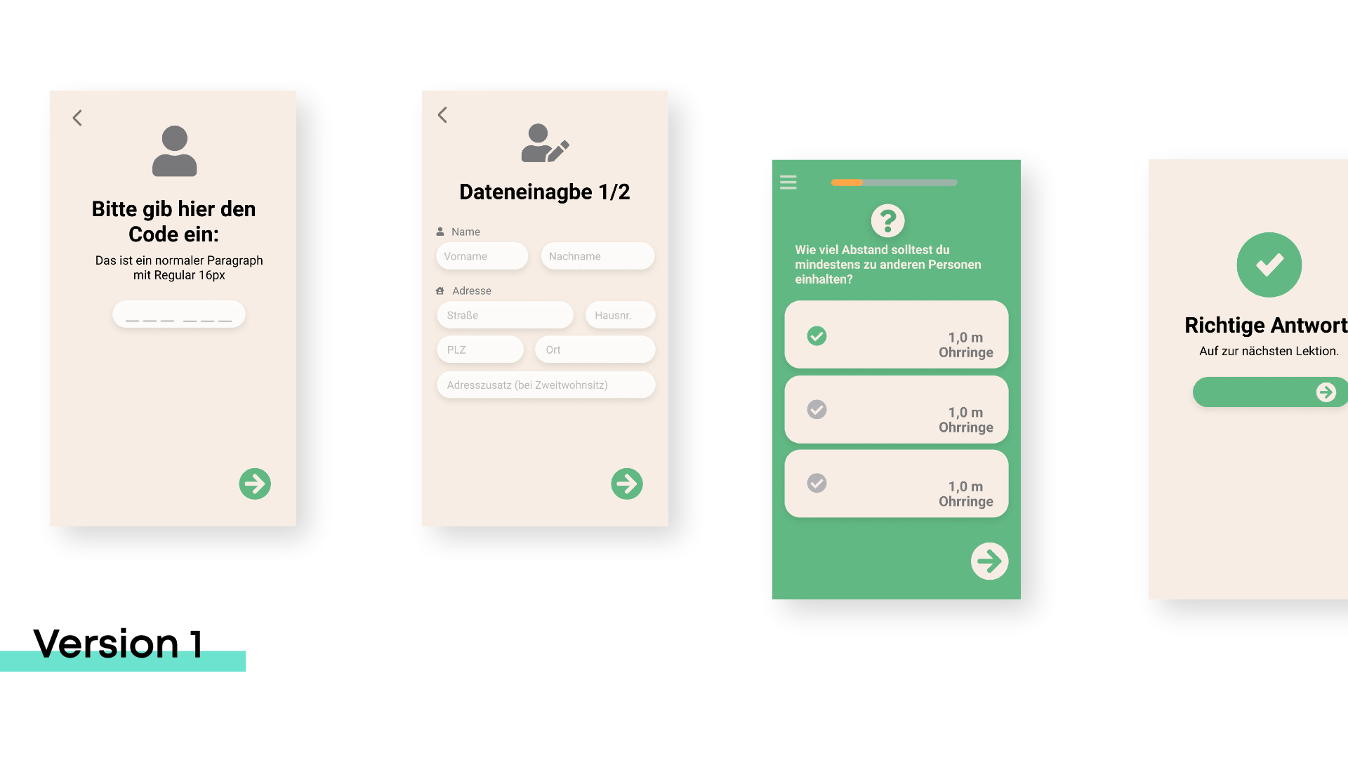
Version 1 — early screens: manual code entry, multi-field data form, text-based quiz answers. Conceptually correct, but too demanding for the target group.
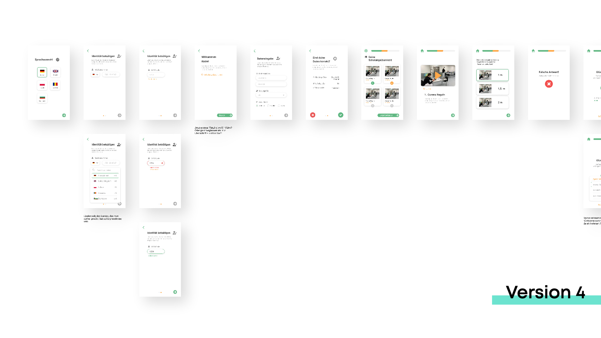
Version 4 — refined authentication flow, language-country disambiguation, progress indicators added, quiz answers partially shifted to image format.
Version 1 → 4: Manual phone number entry replaced with link-based identification after users consistently failed to enter their own numbers. Multi-field data forms broken into sequential single-question screens. Text-only quiz answers shifted to image-based answers wherever possible — early testing showed dramatically faster completion and fewer hesitations.
Version 4 → 8: Quiz popup feedback replaced with dedicated screens. One question per module expanded to three questions per module (drawn from a pool of five). Progress bar added throughout. All dropdown inputs eliminated — every selection made visible at once.
Version 8 → 9: Complete visual overhaul. Screen real estate used more fully. New colour system developed specifically for the target group, accounting for colour vision deficiencies and cross-cultural colour perception. Every UI element reconsidered: icons reduced to only internationally unambiguous symbols, buttons redesigned to read as tappable even to low-digital-literacy users. Audio read-aloud added for all text content.
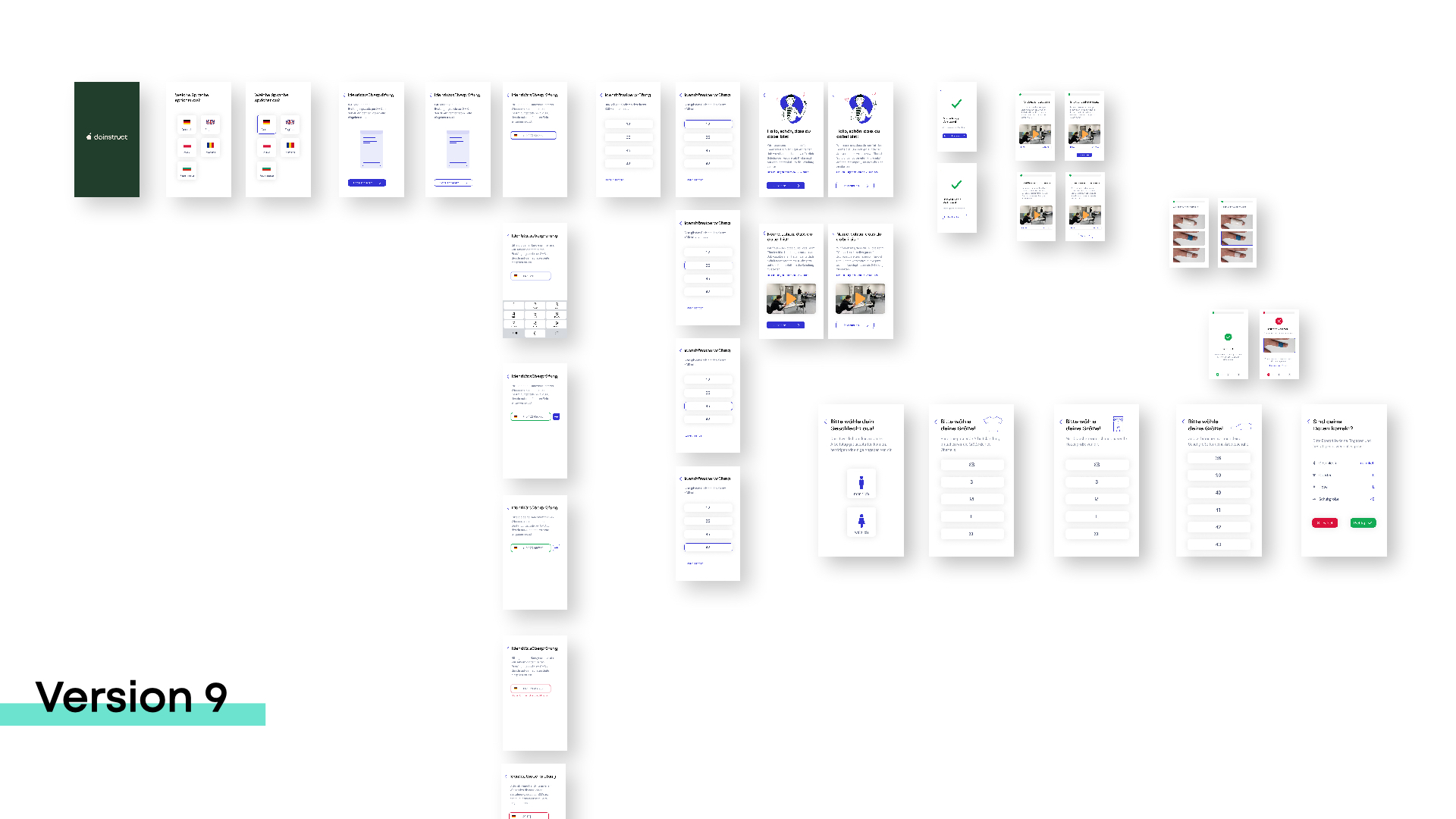
Version 9 — the final prototype. 204 interactive screens. Minimal, focused, and structurally accessible at every step.
Colour system: Blue as primary action colour — culturally neutral, reads as trustworthy. High-contrast greys for body text (targeting 7:1+ contrast ratio). Unambiguous red/green for correct/incorrect feedback only — never used decoratively. All colour choices validated against WCAG 2.0 AA and AAA standards, with Figma plugins used to simulate Deuteranopia and Protanopia.
Typography: Roboto for body text — designed for legibility at small sizes. Mont for headings — geometric, modern, and preferred by users with dyslexia. No decorative type. Minimum 16px body text throughout.
Four rounds. ~60 participants. Real users on-site.
The evaluation ran across four distinct test formats, each asking a different question.
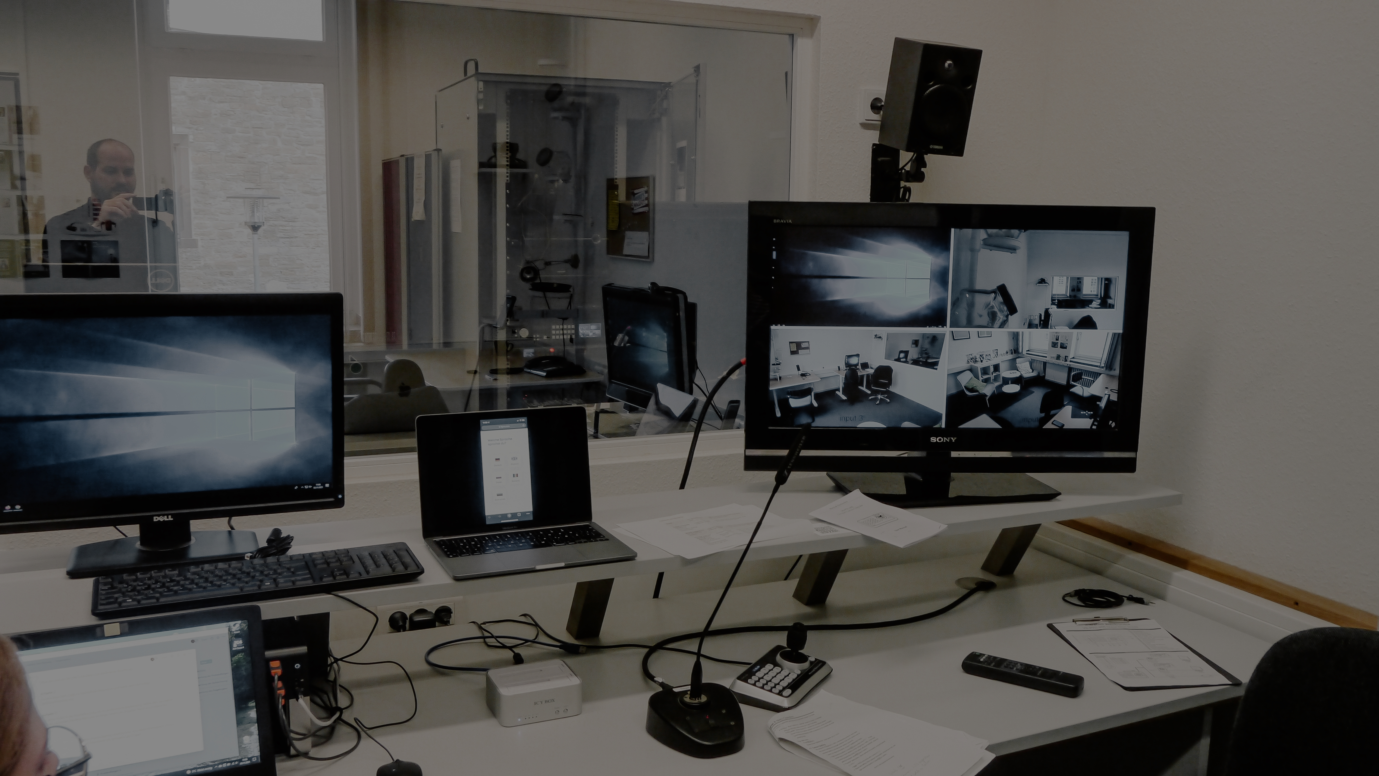
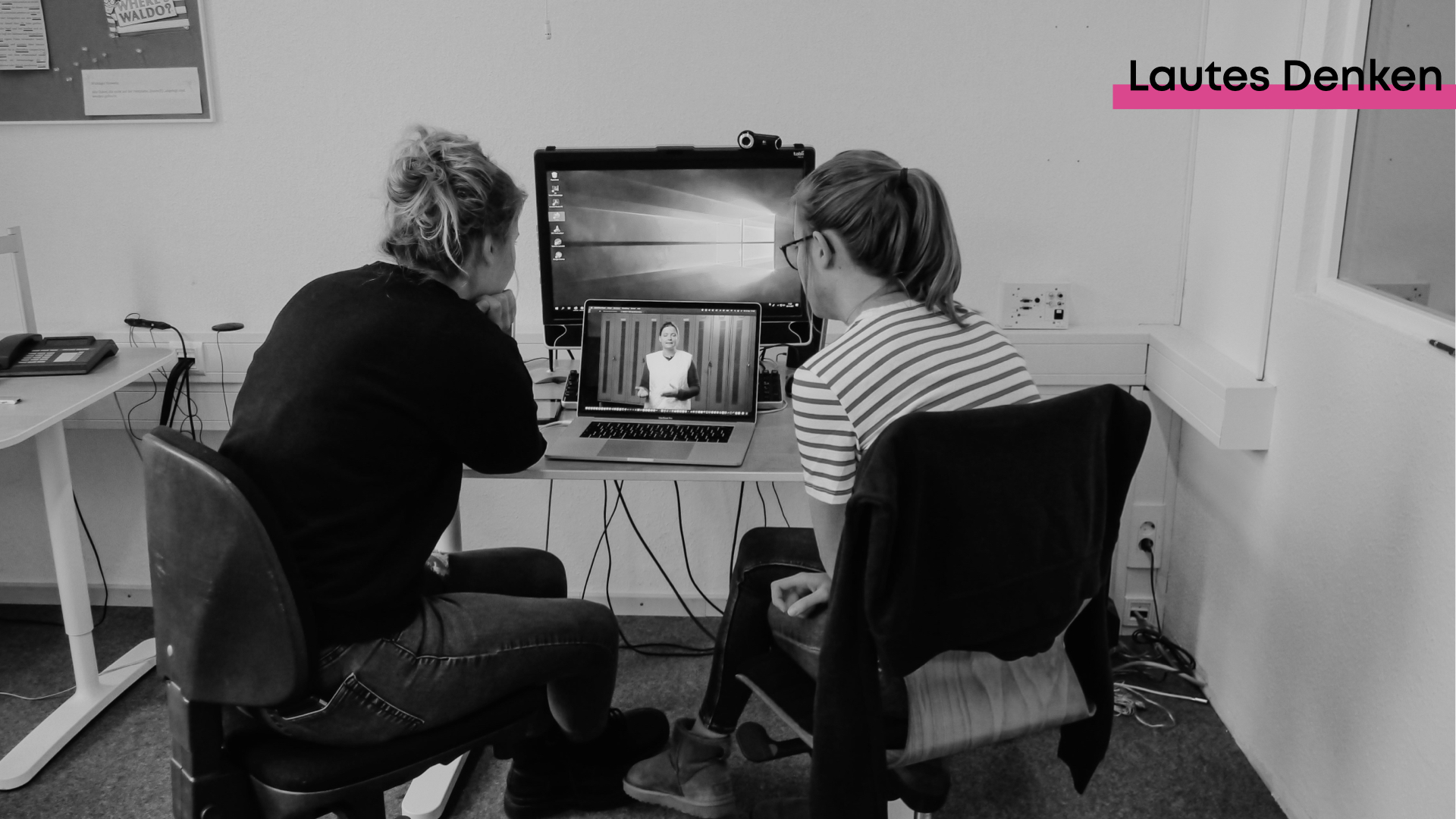
Left: observation room in the Hochschule Osnabrück usability lab — monitoring four camera feeds and the participant's screen live. Right: think-aloud session with eye-tracking active.
Tests 1–3 (on-site, food production company): Conducted in a quiet meeting room within the actual workplace. Participants were Romanian and Bulgarian employees — the real target group. An integration officer translated. 20–25 participants in tests 1 and 2; 6 low-literacy users specifically selected for test 3.
The critical finding from test 1: the two-factor authentication via manual phone number entry was too difficult. Users didn’t know their own number, had to leave the app to check it, and many couldn’t find their way back. This single insight drove the architectural change to link-based identification with multiple-choice code selection.
A structural challenge emerged in later on-site tests: participants treated the integration officer as a shortcut. The moment something was unclear, they asked her — bypassing the interface entirely. She had to leave the room for the results to be valid. The implication was design-level: if users ask for help, the interface isn’t clear enough. There is no fallback in the real world.
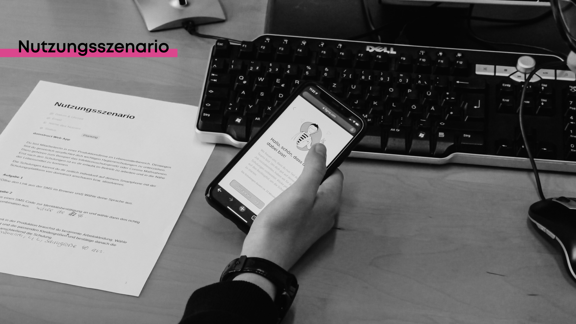
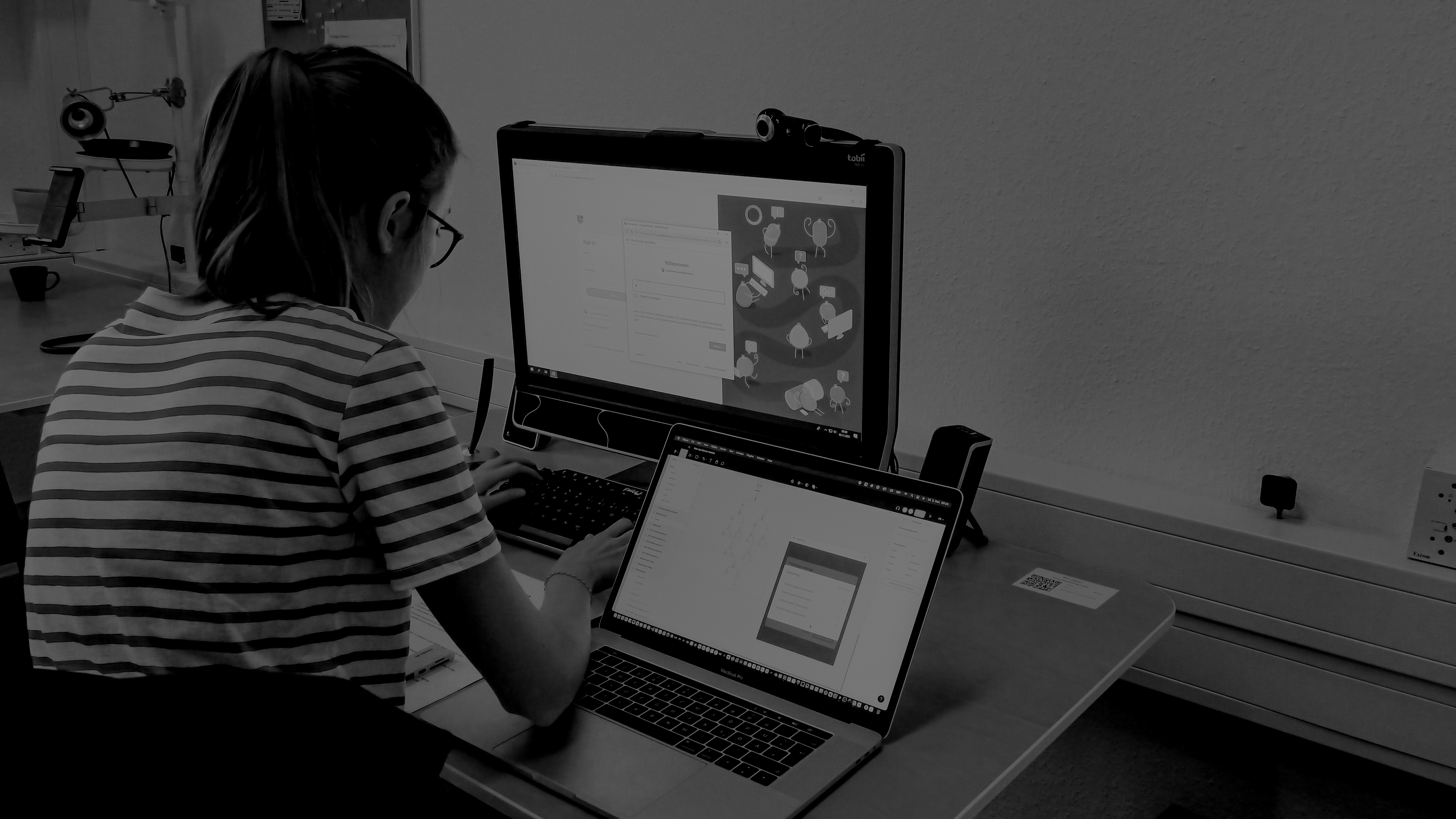
Left: on-site test — real user interacting with the app via smartphone alongside the printed usage scenario. Right: eye-tracking session in the usability lab with Tobii Pro Lab.
Test 4 (usability lab, Hochschule Osnabrück): 9 participants completed structured tasks with think-aloud protocol and eye-tracking (Tobii Pro Lab). This test focused on interaction quality and timing rather than completion rates — measuring fixation duration, gaze paths, and processing time per screen.
Six usability weaknesses were identified and categorised by severity. Four were minor (Selbstbeschreibungsfähigkeit — the system doesn’t make its own state clear enough). One was serious: the “correct answer” feedback screen was being read as an error message. The visual treatment was redesigned before the final version.
Quantitative rollout: 100 employees per week at a company of 17,000, tracked via backend analytics (page load times, step durations, completion rates) and Hotjar session recordings. The recordings made it possible to identify not just that users failed, but exactly where and why.
SUS questionnaire (System Usability Scale) completed by Test 4 participants. Results consistently above 70 — the threshold for “good” usability — across all versions tested.
The most important insight didn't come from the usability lab. It came from watching a user turn to the integration officer the moment something was unclear — and realising that in the real world, there's no one to turn to. Designing for independence meant making every step so obvious that asking for help wasn't necessary.
The HR side of the system
Parallel to the employee-facing app, a backend was designed for HR managers, quality officers, and training coordinators. It makes the system manageable without requiring technical expertise.
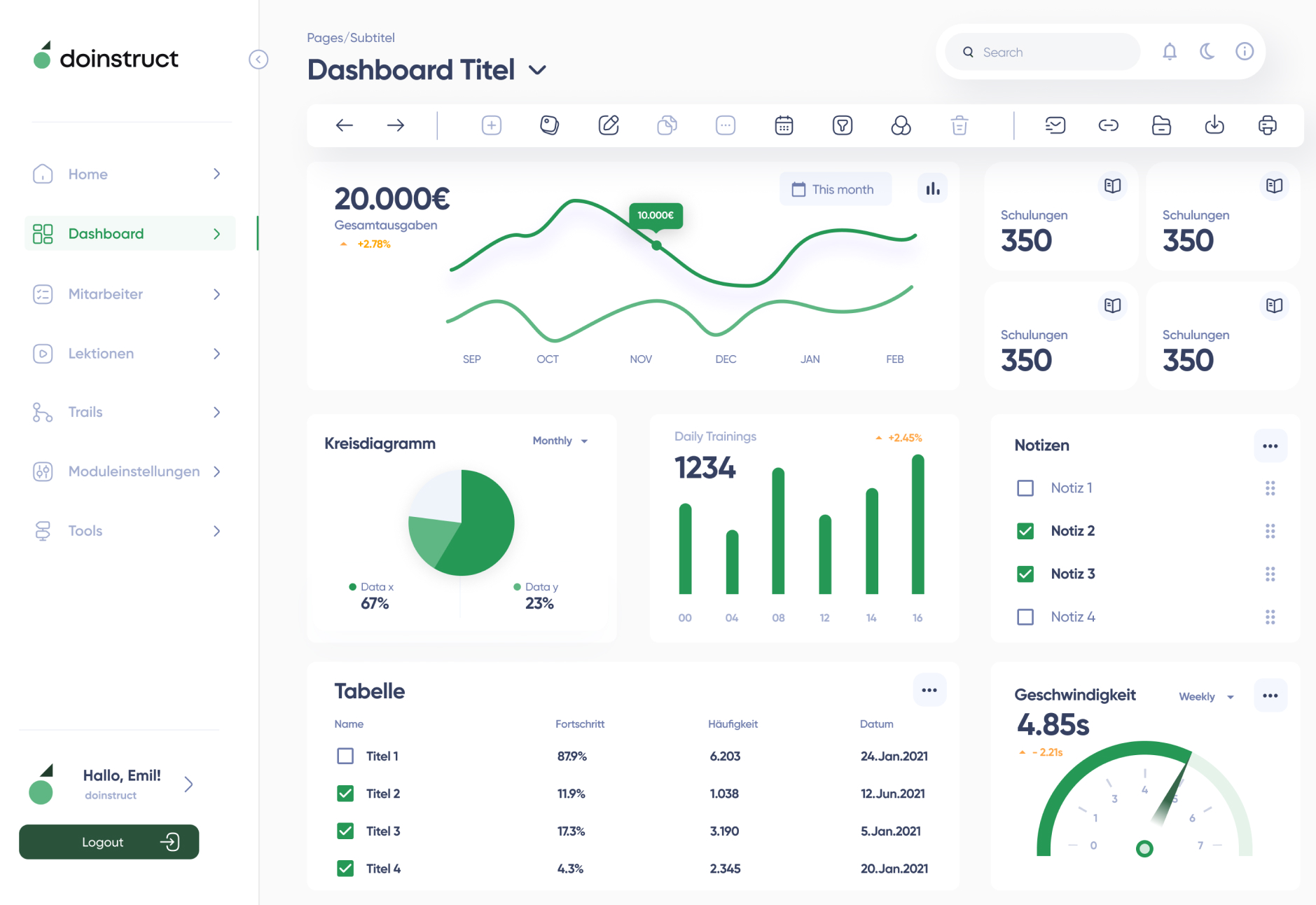
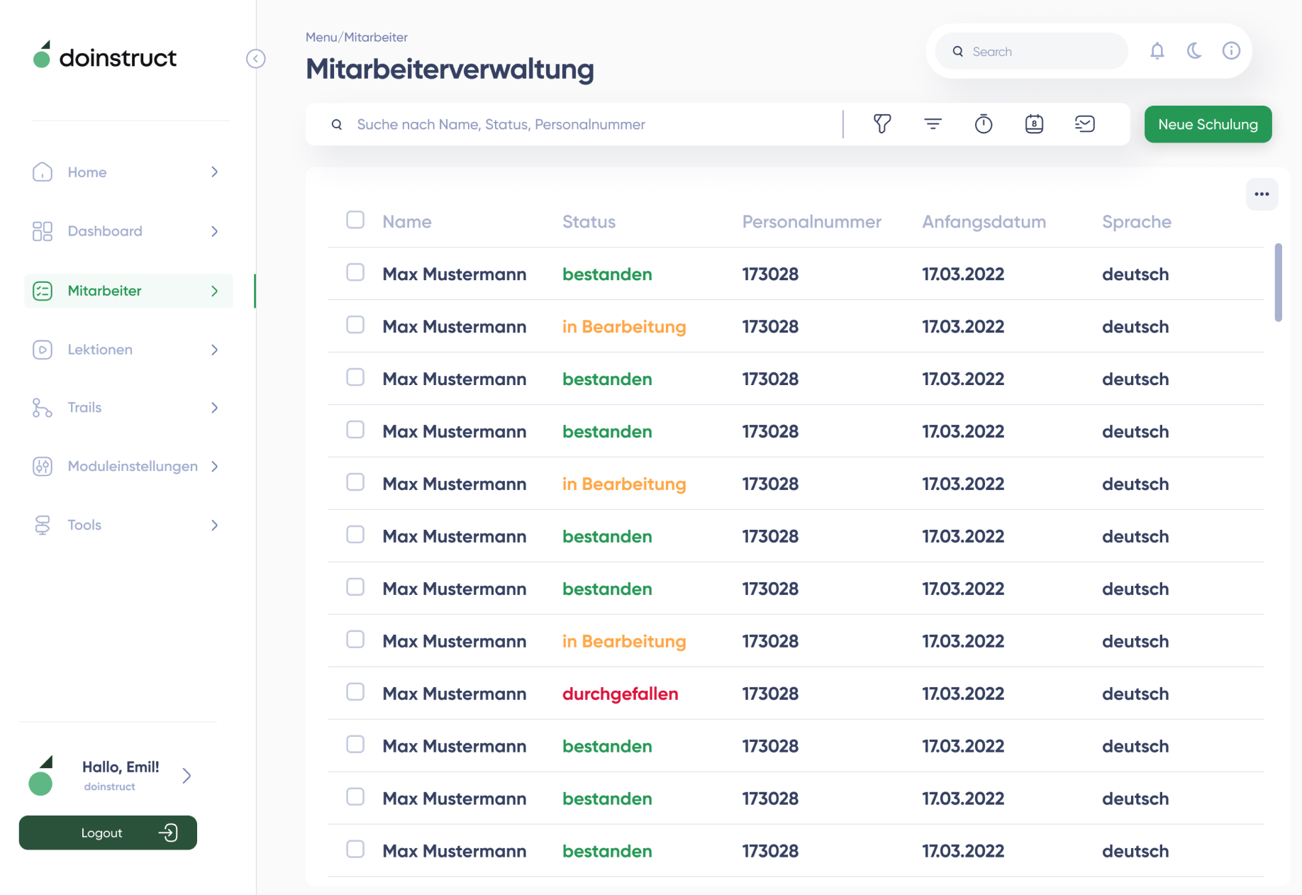
Left: analytics dashboard with training cost tracking, daily completions, and module-level performance. Right: employee management — completion status, in-progress, and failed trainings at a glance.
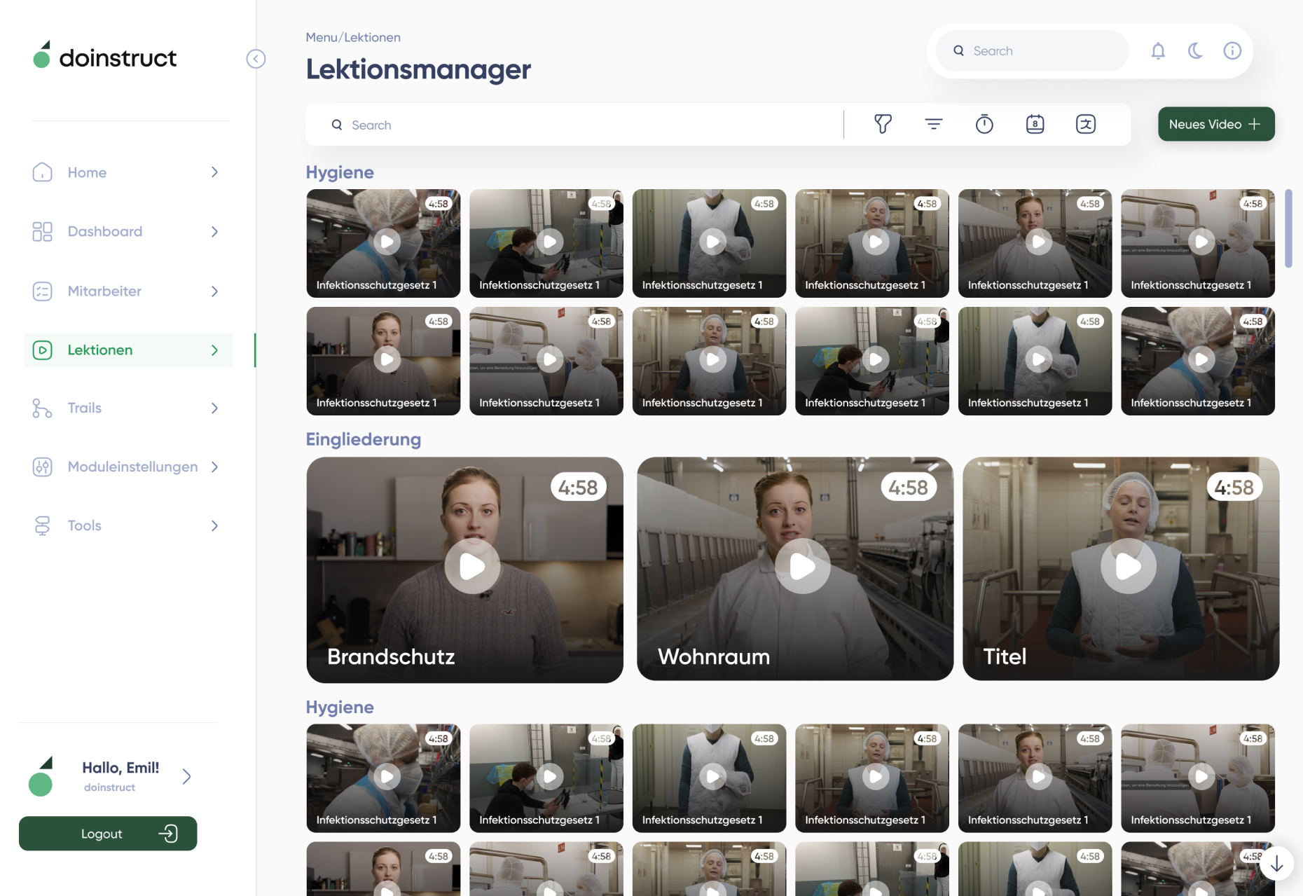
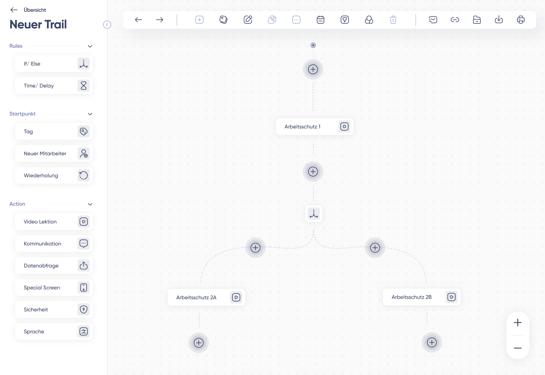
Left: lesson manager — all training videos organised by topic and language. Right: trail builder — drag-and-drop training sequence editor with conditional branching.
The backend covers five modules: a dashboard for monitoring completions and failures in real time, a lesson editor for uploading and tagging videos per language, a trail builder for sequencing training modules with conditional logic, an analytics view for processing time per step, and a gatekeeper module for on-site supervised training sessions.
What designing for someone genuinely different from you teaches you
This was the first project where the gap between me and the users was real and irreducible. I couldn’t simulate what it’s like to open an app in a language you don’t fully read, on a shared phone, in a new country, before your first day of work.
That gap is exactly why the methodology mattered. Every assumption I had about what “obvious” meant turned out to be culturally or experientially specific. The phone number problem wasn’t a UX problem — it was a life problem. People in this situation often don’t have their number memorised because they don’t call themselves. No amount of good copy would have fixed that.
Working through nine iterations taught me that the first version of anything is a guess. The testing is where the real design happens. And the moment you stop testing with real people — particularly the people who are hardest to reach — you start designing for yourself.
Inclusive design isn’t a checklist or a compliance requirement. It’s a commitment to staying curious about people whose experience you can’t assume. That mindset has shaped every project since.