Starting point: a static dashboard in a dynamic world
Car dashboards have barely changed in decades — they show the same information regardless of whether you’re stuck in city traffic or cruising on a motorway. The core question of this thesis: can a dashboard that adapts to the driving situation genuinely improve usability without causing more distraction than it removes?
The project started with an analysis of the current state at Mercedes-AMG: no user studies or usability tests had been conducted as a basis for new UI generation concepts. That gap was the starting point.
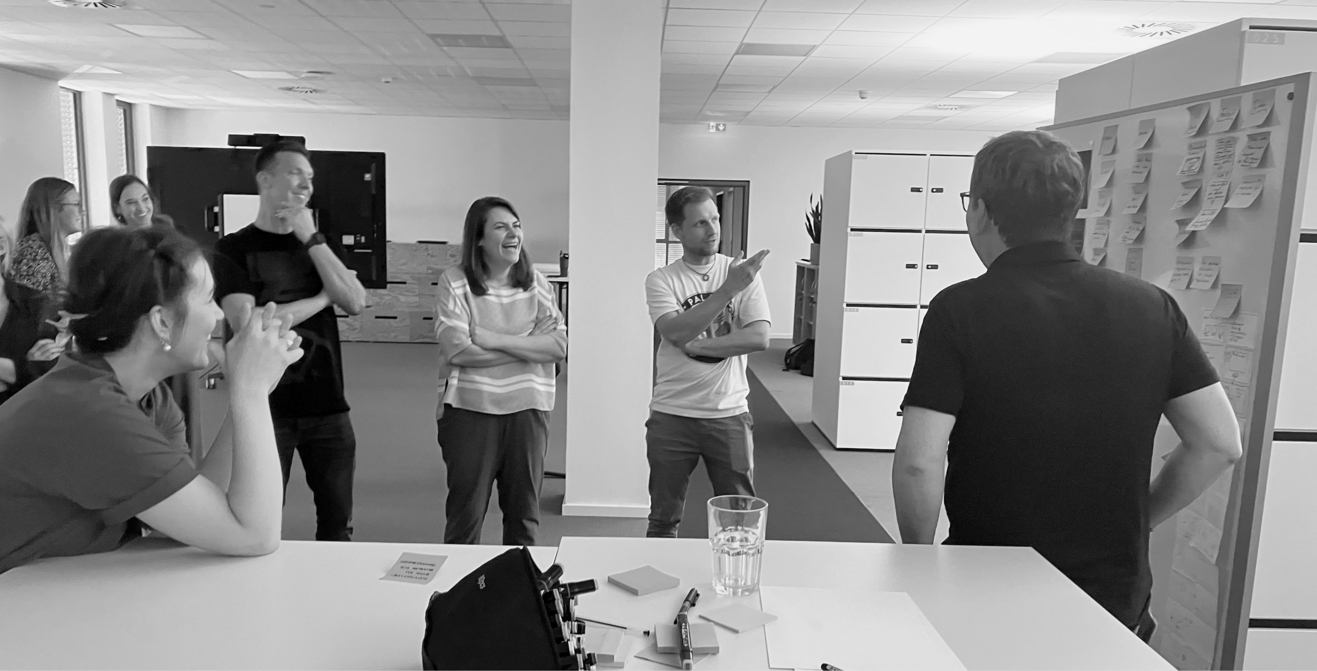
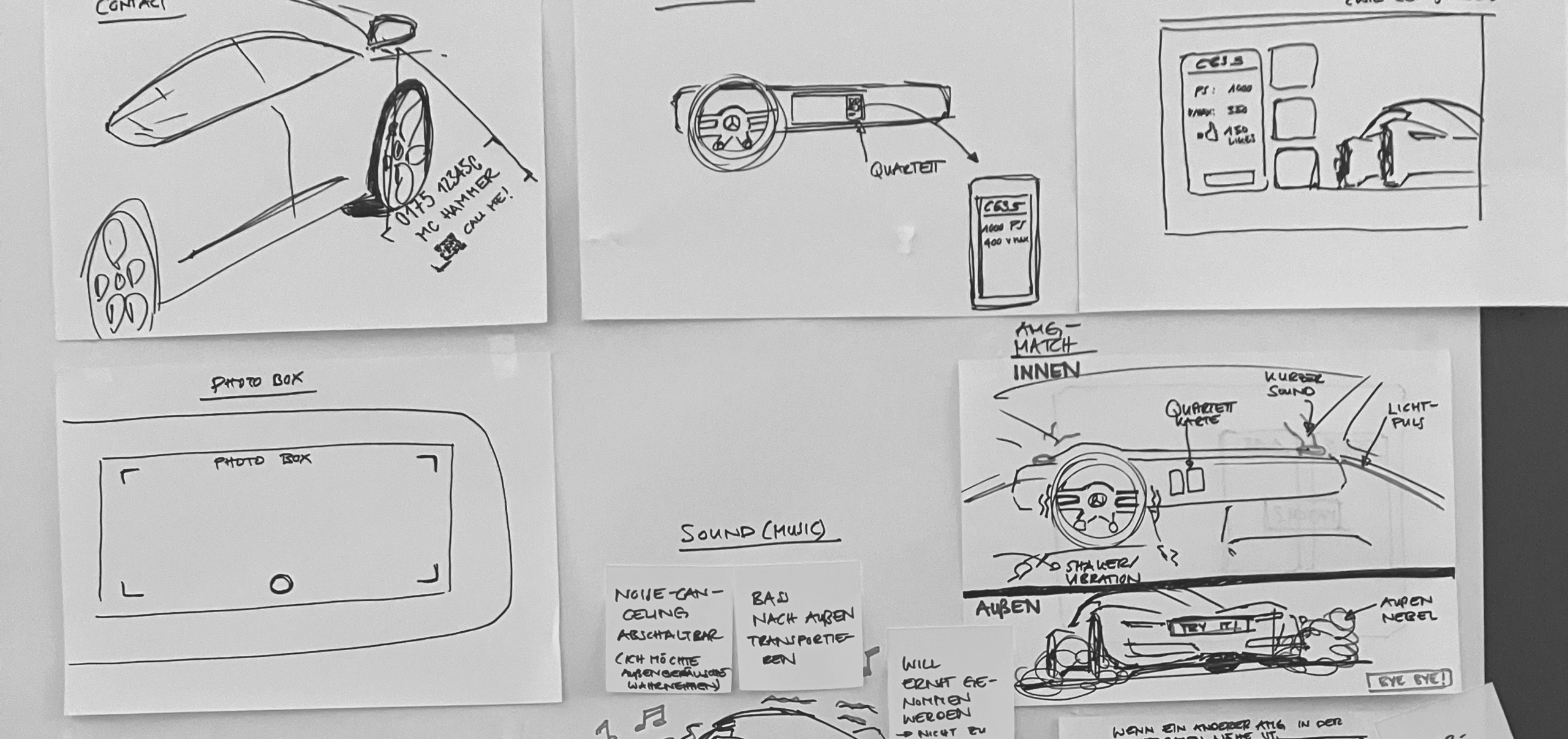
Stakeholder workshops — mapping information needs across driving scenarios
Benchmarking existing interfaces
Before designing anything new, I analysed existing in-vehicle interfaces to understand what works and where the gaps are. I looked at direct competitors and interaction patterns across navigation, media, and driving modes.
The core finding: no system genuinely adapts its content to context. Every HMI is a fixed layout with optional user customisation — a dashboard designed for the highway is the same one you stare at in a parking garage.
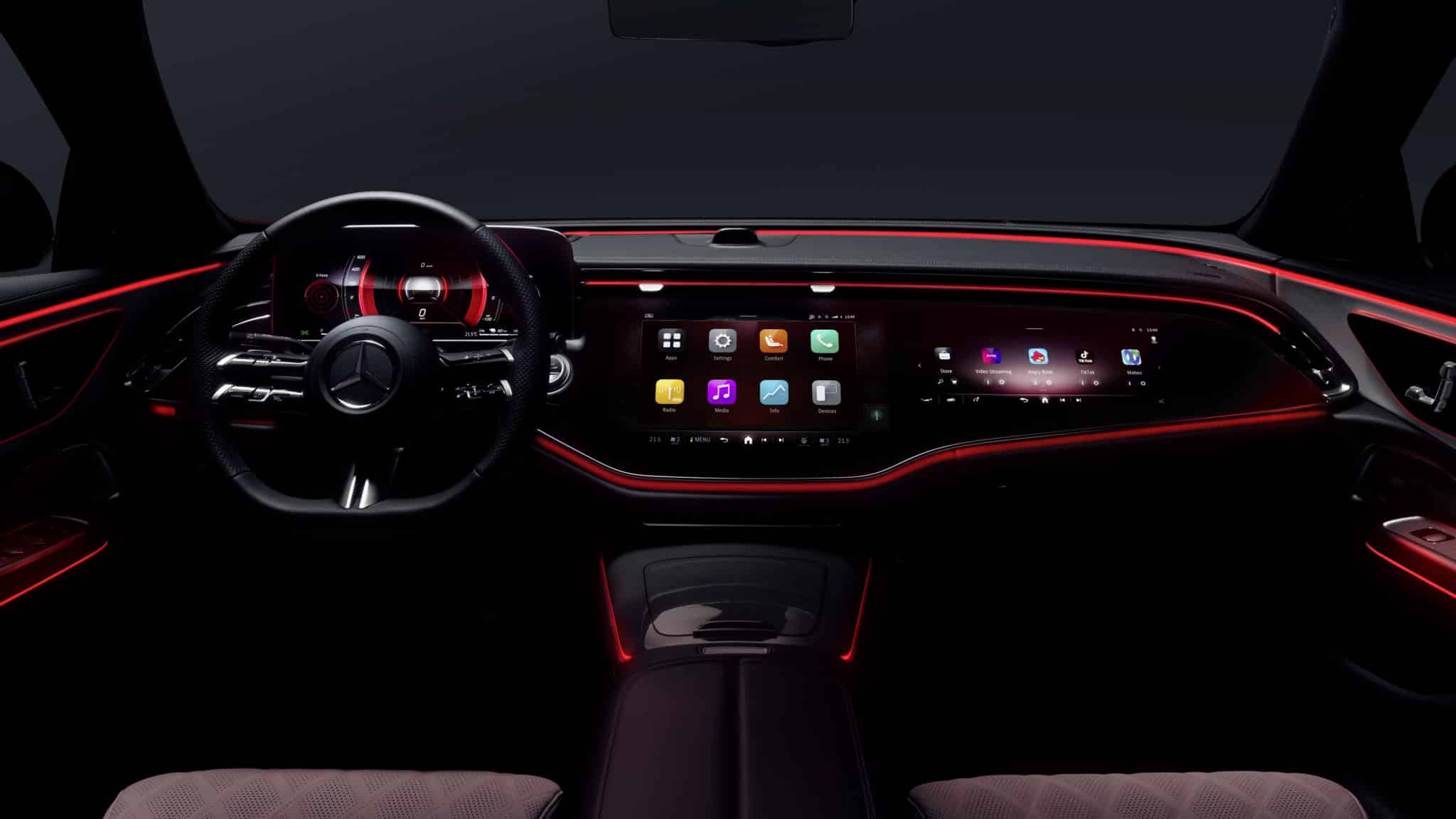
Four modes. One system.
Based on the research, I defined four driving contexts — each designed around a specific real-world use case. The same core interface adapts its content, hierarchy, and interactions depending on where and how you’re driving.
Daily Commute
Urban · Stop & GoUrban trips with frequent stops. Navigation, traffic density, quick glanceable interactions.
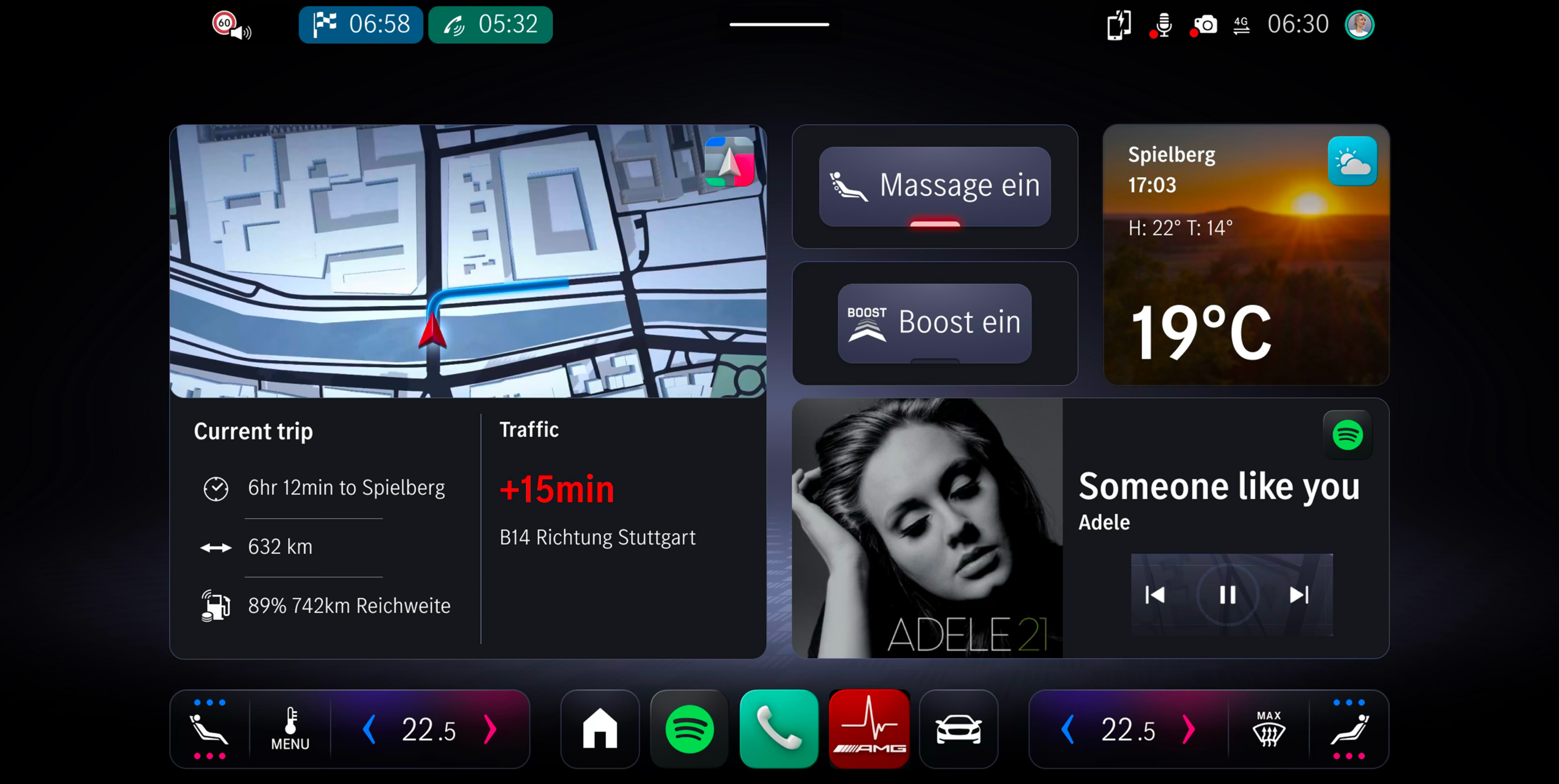
Weekend / Long-distance
Highway · Low Cognitive LoadHighway driving, lower cognitive load. Range, media, comfort settings front and centre.
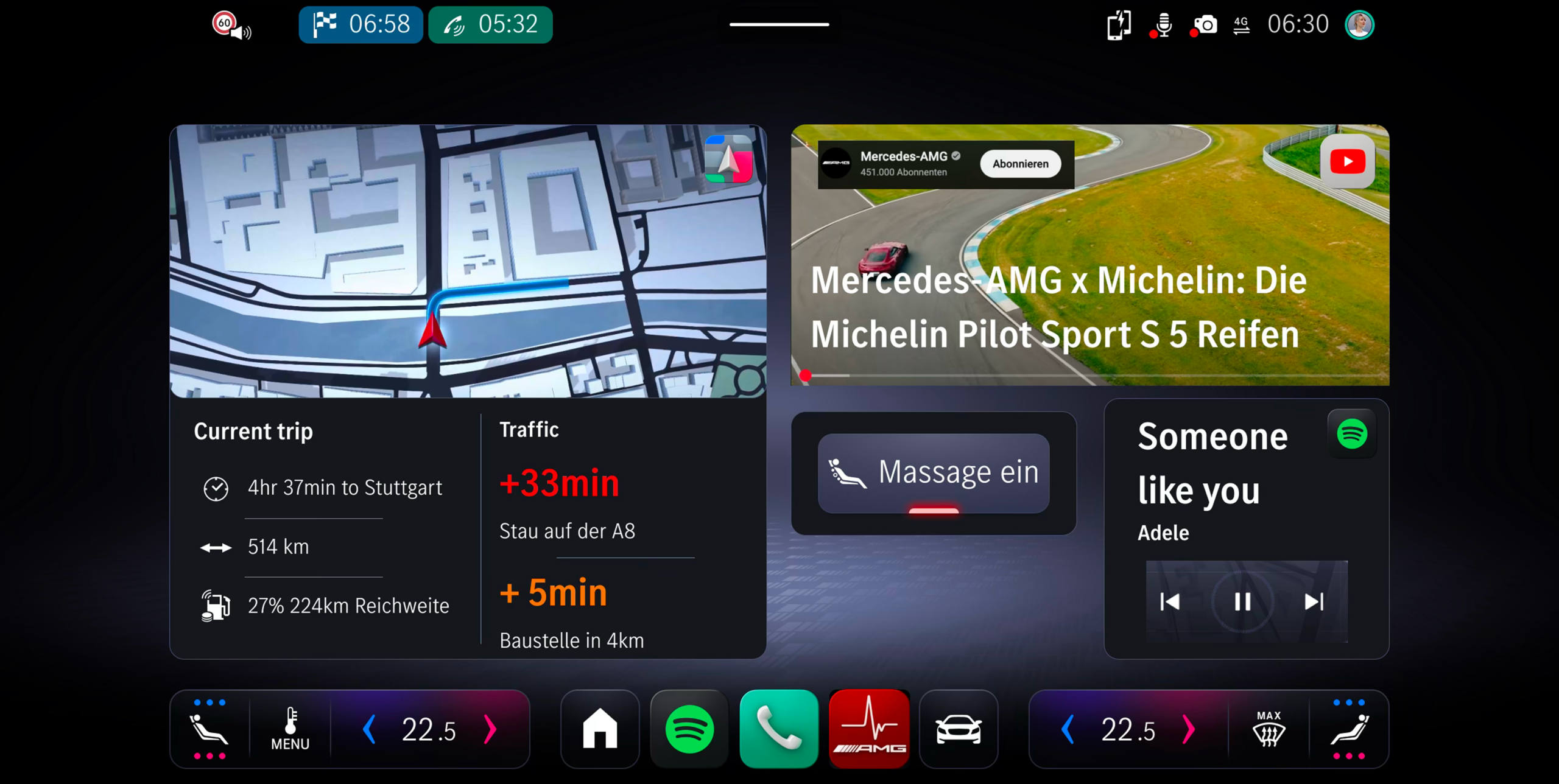
Stop & Go Traffic
Congestion · High FrequencyHigh-frequency micro-decisions. Minimal distraction, proximity and distance information.
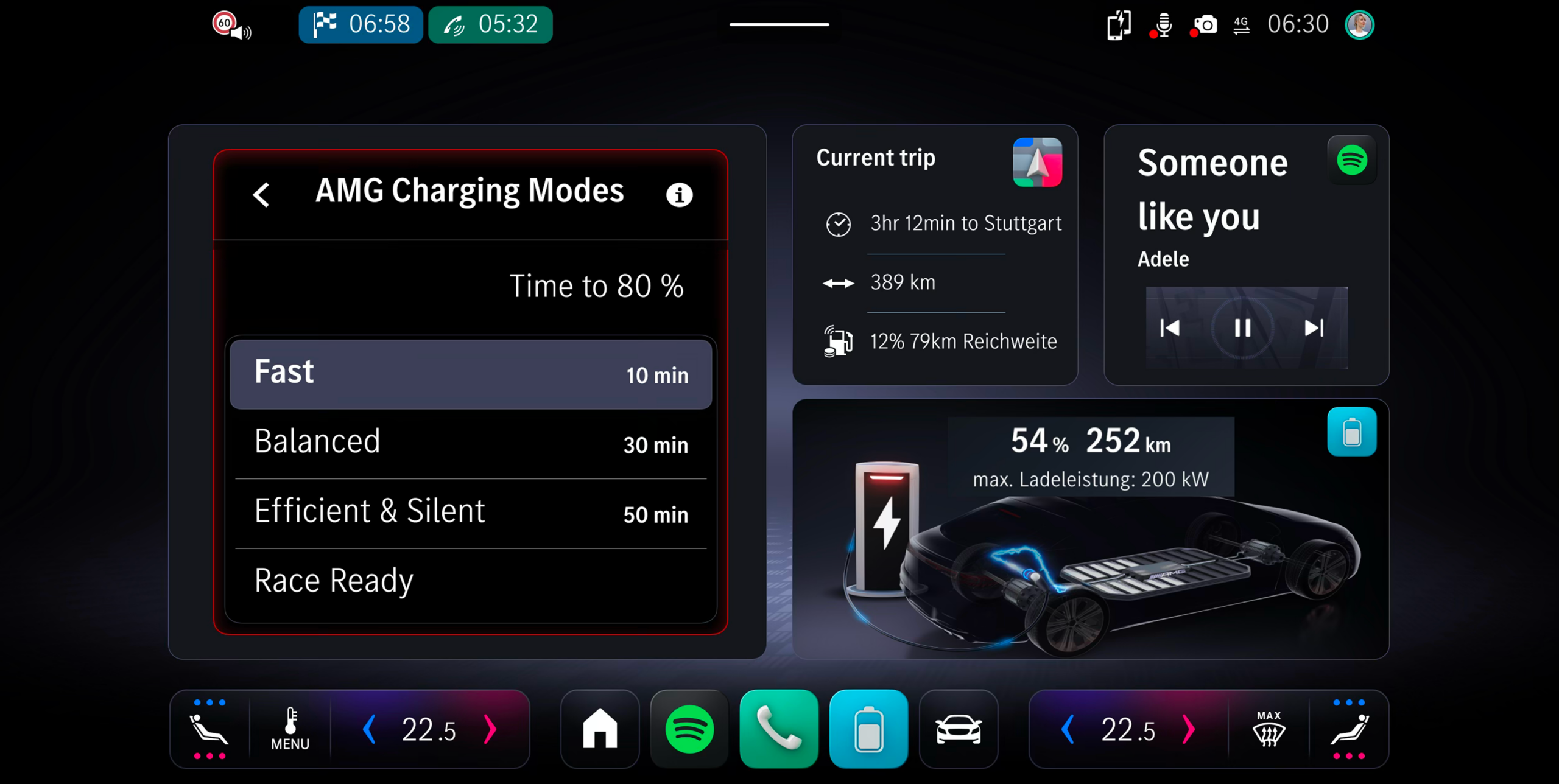
Charging Situation
Stationary · WaitingStationary, waiting context. Charge status, time estimate, ambient media.
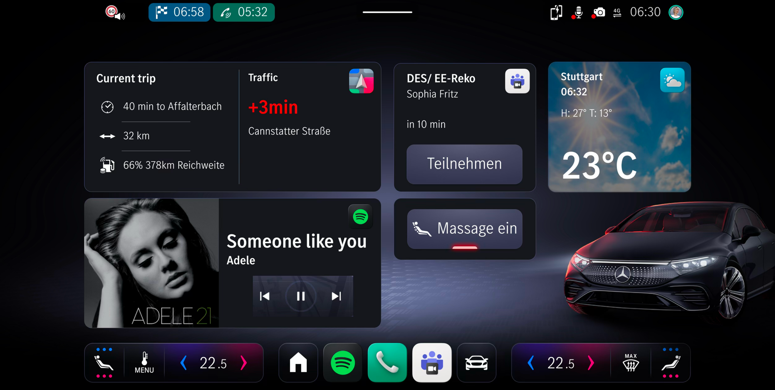
From screen to steering wheel
To test the concept in a real environment, I built a high-fidelity interactive prototype using ProtoPie Studio and deployed it directly to the central infotainment display via CarConnect — enabling participants to experience the adaptive UI in an actual moving vehicle, not just on a laptop screen.
The prototype covered the full interaction logic: all four dashboard modes, transitions between them, touch inputs on the vehicle display, and live signal linking with actual driving data.
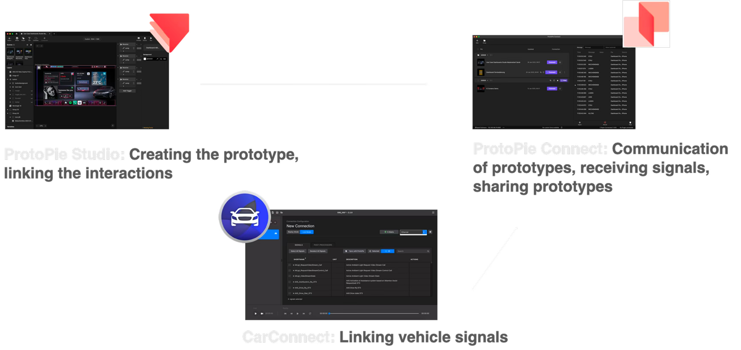
Linking ProtoPie interactions and vehicle signals — how ProtoPie Studio, ProtoPie Connect and CarConnect work together to bring the prototype into the car
What the data said
The study followed a structured format: a pre-survey to capture expectations, four drives through different scenarios (each triggering a different dashboard mode), think-aloud feedback during the drive, and a post-survey afterwards.
The shift between before and after was striking. Before the drive, 85% of participants were concerned about distraction. After: 0% found the routine adaptations distracting. 54% initially preferred fully manual control — that dropped to 18% after experiencing the system.
The biggest shift wasn't in the interface — it was in expectations. Participants came in worried about distraction and loss of control. After experiencing the system, those concerns largely disappeared. The implication: the fear of automation is often greater than the reality.
What I take away
This project pushed me to think differently about automation and control. The instinct in UX is often to give users more options — but in a moving vehicle, more options compete with the primary task of driving. The interesting design challenge was: how do you build a system that adapts intelligently without feeling like it’s making decisions for you?
Working solo on a project of this scope — from stakeholder analysis to prototype to in-vehicle user study — also taught me how to move forward with incomplete information. In automotive development, you rarely have all the data you want before a decision needs to be made.