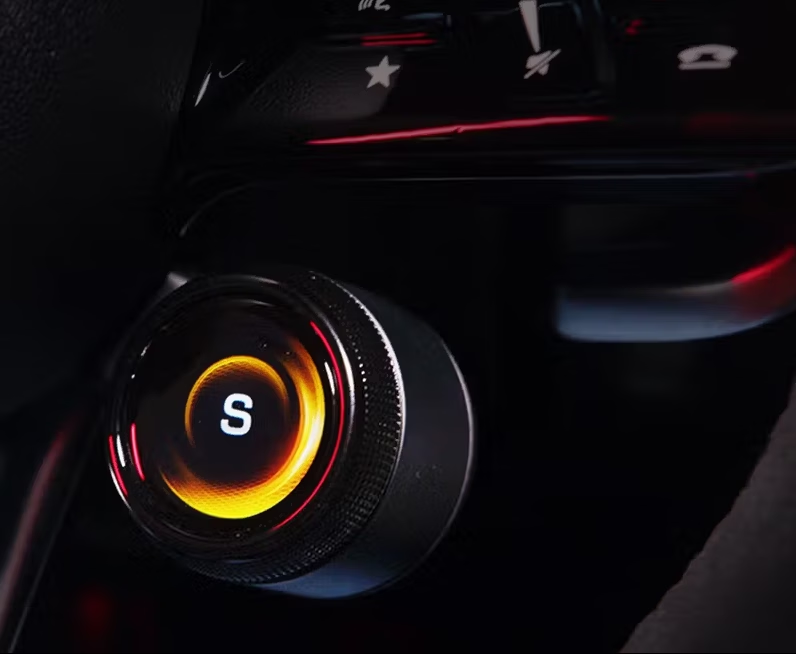
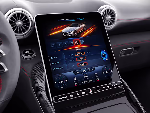
AMG Dynamic Select: the most used control in the car
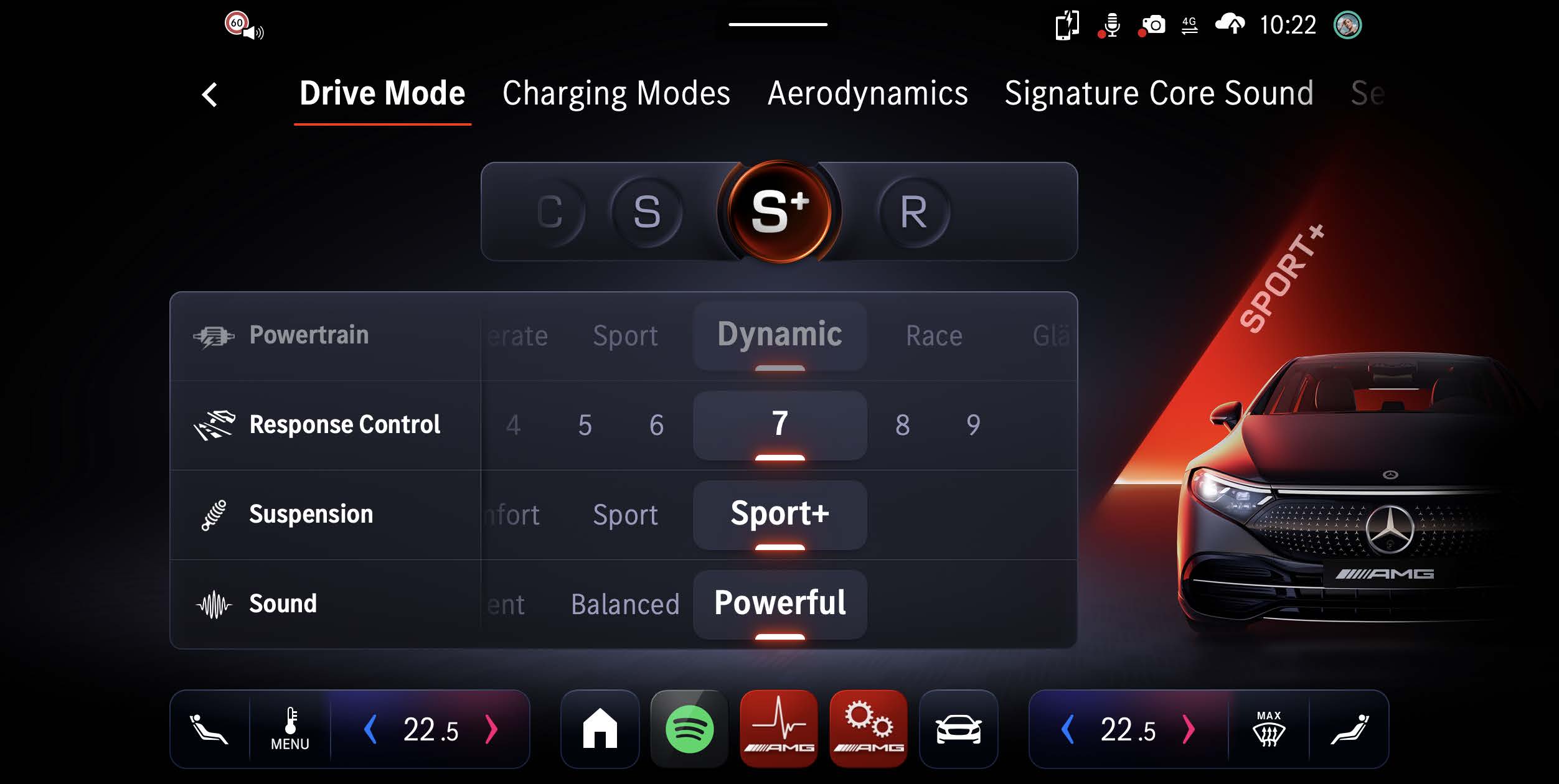
AMG Dynamic Select is the driving mode selector — the control that determines whether you’re in Comfort, Sport, Sport+ or Race. For AMG drivers, it’s not a settings menu; it’s an active driving tool, used multiple times per journey.
The HMI team had developed three distinct UI concepts for the next-generation selector. Each had internal advocates. Nobody had user data. My brief: run a structured comparison study and deliver a clear recommendation backed by evidence.
An 8-step research process
The study followed a structured eight-step process designed to minimise bias at every stage — from how stimuli were prepared to how results were synthesised before the team saw them.
01 Kick-off — Align on research questions and success criteria with the HMI team
02 Preparation — Stimuli design, test protocol, scenario scripting
03 User Management — Recruiting, scheduling, consent and briefing
04 Drive & Test — In-vehicle sessions on a defined test route
05 Usability Testing — Standardised questionnaires (AttrakDiff, SUS)
06 Evaluation — Affinity mapping, synthesis, findings without the team
07 Presentation — Structured readout with ranked recommendations
08 Revise — Design feedback loop based on stakeholder questions
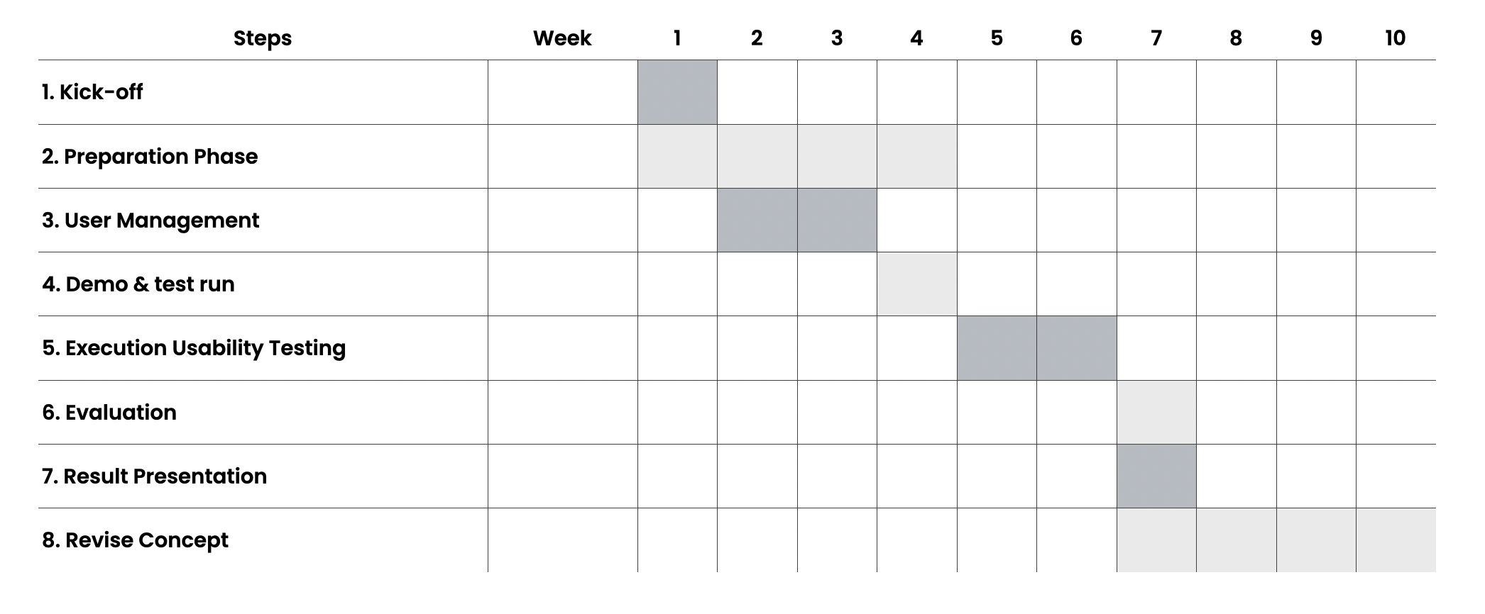
Project plan — 8-step research process from kick-off to concept revision
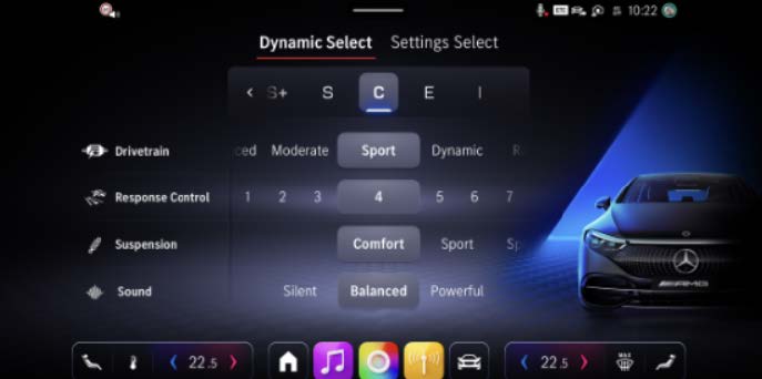
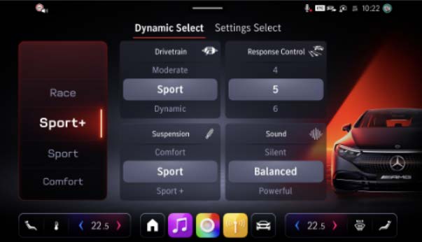
Horizontal Picker vs Vertical Picker vs Slide Control
Horizontal Picker
WinnerModes in a horizontal row. Selection via lateral scroll or direct tap. Current mode centred and highlighted.
Vertical Picker
Modes stacked vertically. Scroll up/down to select. Similar to mobile list pickers.
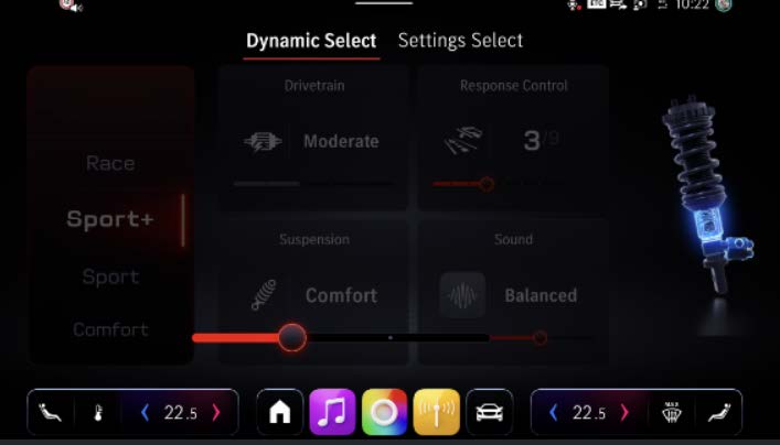
Slide Control
A single slider spanning all modes from left to right. Drag to select, snap to mode position.
17 participants. Real vehicle. Real conditions.
All sessions were conducted in the actual test vehicle on a defined route combining urban, motorway, and winding road segments. Participants interacted with each variant in counterbalanced order to control for learning effects.
Study session — participant evaluating Dynamic Select variants on the defined test route
All three variants were built to the same fidelity in ProtoPie and delivered via the same in-car simulation setup. Visual design was held constant — only the interaction pattern varied — to isolate the effect of UI structure from visual preference.
Horizontal Picker wins — for clear reasons
Post-study debrief — participants explaining their preference for the horizontal layout
The Horizontal Picker outperformed on every metric that matters for in-car interaction: task speed, error rate, subjective usability, and stated preference. Participants consistently described the horizontal layout as “obvious” and “already knowing where things were.”
The recommendation was accepted. The design team used the findings to resolve a months-long internal debate, and the Horizontal Picker moved forward into the next engineering phase.
The best outcome of a user study isn't a surprising result — it's a clear one. Clarity that ends debate and moves a team forward.
Research as a decision-making tool
What struck me most about this project was how much the team needed permission to decide. Three smart people had been arguing about three good options for weeks. The study didn’t reveal anything they couldn’t have guessed — but it gave them something to stand behind.
That’s what research does at its best: it transforms preference into evidence, and evidence into momentum.